Tuesday, April 23, 2024

Mapping a Global Coral Bleaching Event

an animated GIF of ABC News' globe of global coral bleaching

Last week the National Oceanic and Atmospheric Administration (NOAA) reported that the 'world is currently experiencing a global coral bleaching event'. The Earth has experienced 10 consecutive months of global heat records,  and in the last year the average global temperature has exceeded pre-industrial levels by 1.58C. These unprecedented sudden rises in air surface temperatures are having a devastating effect on the world's coral reefs.

When the oceans get too warm, corals expel the algae that live within them. This algae provides the corals with vital nutrients and without this algae the corals turn white or pale and are much more susceptible to disease and death.

Australia's ABC News has mapped out the extent of coral bleaching in coral reefs around the world. A 3D globe in The Great Ocean White-Out visualizes the current level of risk to coral reefs. The map uses the reef bleaching alert scale to show the level of risk to individual coral reefs.  The map shows that coral bleaching is now a global problem and, according to ABC News, "For the first time ever, coral (is) bleaching on both the Atlantic and the Pacific side of Panama at the exact same time".

In NOAA's announcement of a Global Coral Bleaching Event the agency reports that this is the second global bleaching event in just the last ten years. NOAA suggests that this "global event requires global action". Which is in itself extremely worrying as the world's governments seem unwilling to even meet the voluntary emissions targets that they set themselves in the 2015 Paris Agreement on climate change.


Monday, April 22, 2024

Tiny World Map

Tiny World Map is a map of the whole wide world condensed into a very small file size. It has been designed to be used offline and with low-bandwidth web apps. The whole map is only 300 kB gzipped and apparently it works on even "low-end decade-old phones, with no discernible lag".

The main reason that Tiny World Map is so small is because it isn't much of a map. As far as I can tell Tiny World Map consists almost entirely of a very low resolution country border layer, a layer of country placename labels, and the placename labels of the '10,000 most populous cities'. 

Of course using such course mapping data means that the map is not very accurate - for example if you zoom in on coastlines around the world you will start to notice that many city placename labels are displayed off the coast, suggesting that these cities are located somewhere under water. 

The map uses service workers which means that you don't have to download anything onto your phone in order to use the map when you are offline. You just need to visit Tiny World Map when you have internet access and the map should be cached so that you can then use the map even when you don't have access to an internet connection.

However I am struggling to think of a use-case for Tiny World Map. I can't think of an occasion when I might need a low resolution map which only contains country borders and the labels of the so-called 10,000 most populous cities in the world - even when I'm offline. 

The fact that I can't think of a use case for Tiny World Map doesn't mean that there isn't one. I've never understood the point of what3words and that's now a global multi-million dollar company. 

Saturday, April 20, 2024

Slim City

For a number of years I've had the idea of creating an incremental game which involves slowly creating a city map by adding different map elements over time. This week I decided to try and put that idea into action. The result is Slim City, an idle game which requires you to click on building footprints on an interactive map to build and create a map of a city neighborhood.

In Slim City the more buildings you own then the more of the city map is completed. Each day you earn rent from all the buildings that you own. So, if you run out of money, you just need to wait until the city clock reaches midnight.

And that's it really. To be honest - as it stands Slim City isn't much of a game. I could improve the game by adding more city management features but I am actually going to stop developing this game for now and maybe later start from scratch on version two of Slim City. 

There are a couple of reasons for starting a new version of the game. The first is that at the moment the game has to make lots of calls to the Overpass API to fetch the map data. This really isn't a good idea. My idea now is to instead download all the OpenStreetMap data for a small 200 meter x 200 meter area. I can then re-purpose that data in any way that I require to enable players to slowly add features to a city neighborhood map during a game - without having to make lots of calls to the Overpass API.

The second reason that I'm going to start from scratch on SlimCity 2.0 is that I now have a better idea for some fun city management elements that can be added to the game. I think that these ideas will work better if I start over from the beginning and bake in these features from the very start of development.

Friday, April 19, 2024

⅓ of Rafah’s Buildings Destroyed

satellite imagery of Rafah showing damaged buildings and tents

Bloomberg has analysed satellite imagery of the Palestinian city of Rafah and determined that Israel has damaged or destroyed about 32% of the region's buildings.

In How the Israel-Hamas War has Reshaped Rafah in Gaza Bloomberg presents a satellite image of the Palestinian city. As you scroll through the article a layer is superimposed on top of this satellite view to show buildings which have been damaged (in orange) and tents or other new structures (in yellow). As you scroll south across the region it is impossible to not be shocked by the devastating destruction of the region by the Israeli attacks.

The Bloomberg analysis used machine learning to compare two satellite images of the region - one image captured in November of last year and a more recent satellite image captured at the end of March. The machine learning model was trained to look for tents and for new structures. In the article Bloomberg also reports that 'Across the entire Gaza Strip, about 56% of buildings have been damaged'.

a close-up satelitte view of a Gaza neighborhood colored almost completely red

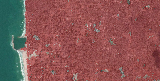
The Guardian has also used satellite imagery and open-source evidence to map the mass destruction of buildings and land in Gaza. In January the newspaper published a story-map How war destroyed Gaza’s neighbourhoods, which guides you through satellite imagery of three neighborhoods in Gaza (Beit Hanoun, al-Zahra and Khan Younis) documenting the destruction of civilian infrastructure by Israel.

The destroyed buildings in the satellite imagery in The Guardian's map are colored red. However, as the map automatically pans over Gaza, it quickly becomes apparent that it would have been easier for The Guardian to color in the undestroyed buildings as there is very little civilian infrastructure left in the three neighborhoods.

As well as the satellite imagery of Israel's destruction of civilian infrastructure the map is illustrated with video evidence of the Israeli attacks. This destruction of civilian infrastructure by Israel includes bombed schools, mosques, hospitals and people's homes. So far 1.9 million people have been forced to leave their homes in Gaza and, according to The Guardian, the scale of destruction carried out by Israel has "led some experts to describe what is happening in Gaza as 'domicide', ... widespread, deliberate destruction ... preventing the return of displaced people." 

a satellite view of Gaza with lots of damaged buildings colored red

In November a researcher at UCL's CASA released an interactive mapping tool to help researchers and news agencies "estimate the number of damaged buildings and the pre-war population in a given area within the Gaza Strip". The Gaza Damage Proxy Map is based on an earlier tool which was developed to estimate damage caused by Russia in Ukraine.

The Gaza Damage Proxy Map colors individual buildings in the Gaza Strip to indicate the probability that the building has suffered damage since October 10, 2023. If you use the map's drawing tool you can highlight an area of the Gaza Strip on the map. The Gaza Damage tool will then automatically estimate the number of damaged buildings in the highlighted area and the estimated affected population. The percentage of the buildings damaged in the area is also calculated for you. If you select individual damaged buildings on the map you can view information on the date of the damage and view a link to the source media for the damage report.

The Gaza Damage Proxy map uses Synthetic Aperture Radar imagery captured by satellites to detect damaged buildings. By measuring the change in the intensity of these radar waves since before the Israeli attacks on Gaza it is possible to estimate the probability that individual buildings have been damaged. Damage points from the UN Satellite Office (UNOSAT) have also been used to validate the accuracy of the damage detection algorithm used by the map. The map itself also includes an optional layer which adds geo-located footage of strikes and destruction in Gaza as triangular map markers.

You can learn more about the methodology used to estimate building damage in Gaza in the Bellingcat article, A New Tool Allows Researchers to Track Damage in Gaza.

Thursday, April 18, 2024

The American Home Values Map

a dot density mao of the USA showing home vaues

Home Values in America is a dot density map showing the self-reported value of homes across the whole United States.The map shows home values across the United States using data from the U.S. Census Bureau's 2018-2022  American Community Survey (ACS). The ACS  is a large-scale survey that gathers information about the American population every year.

The colored dots on the map show the self-reported values of owner-occupied homes. These values are self-reported by ACS respondents when asked the question "how much do you think this house and lot, apartment, or mobile home (and lot, if owned) would sell for if it were for sale?" The dots on the map don't reflect the actual locations of respondents. Each dot is mapped randomly within its census block location.

The map legend shows the values of each color of dot on the map. This legend is interactive which means that you can turn on or off different values on the map, allowing you to explore the density of the most expensive or cheapest homes in a city or any combination of the mapped home values.

You can learn more about the methodology behind the making of the map on the project's GitHub page.

Wednesday, April 17, 2024

The 2024 Cicadapocalypse

a cicada brood map showing in which year cicada broods will emerge in the USA

2024 is set to see the emergence of two large periodical cicada broods. Both Brood XIX (13-year cicada) and Brood XIII (17-year cicada), are expected to emerge together in 2024 for the first time since 1803. This double emergence has been nicknamed a "cicada-geddon" by some.

Periodical cicadas are native to eastern North America. They spend most of their lives underground as nymphs, feeding on tree root fluids. Depending on the species, they live either 13 or 17 years underground before emerging as adults. As adults periodical cicadas emerge in massive groups called broods. Nearly all the individuals in a brood emerge above ground within a few weeks of each other.

Axios has created a mapped timeline to visualize in which year and where in the USA each of the 13-year cicada and 17-year will emerge and in which year there will be a double emergence. In this visualization a map of the eastern USA is encompassed by two time wheels (a 13-year and 17-year time wheel). Select a year on this map and the two time wheels rotate to show you which broods (if any) will emerge that year.

The Axios article Is 2024 the Cicadapocalypse or a Cicadapalooza? also includes an interactive map which allows you to enter a city in the eastern USA to see in which years the city will experience a cicada brood emergence. 

map showing past sightings of cicada broods
According to the University Of Connecticut's overview of the 2024 Periodical Cicada Emergence, although both Brood XIX and Brood XIII will emerge in 2024 they will "not overlap to any significant extent." 

The university has mapped out past positive presence records of both Brood XIX and Brood XIII. On this map positive presence records of Brood XIII are represented by images of upwards facing cicadas and positive presence records of Brood XIX are represented by images of downwards facing cicadas. The map allows you to see where the two broods have emerged in previous years.

The university also says that even if both broods do emerge in the same area there probably won't be a higher density of cicadas than if only one brood emerged, because "Competition for resources (e.g., food, space, or ovipisition sites) is expected to impose an upper limit on cicada densities".

Monday, April 15, 2024

Backdrop - the Ultimate Challenge

a creenshot of Backdrop showing a map and landscape painting of a church in Warsaw
Backdrop

Backdrop is a map based game which is somewhat similar to the very popular GeoGuessr game. However in Backdrop instead of Google Maps Street View images you have to identify the locations depicted in famous paintings by some of history's greatest artists.

In GeoGuessr you can stroll around in Street View to pick-up clues as to the location that you have been dropped in. In Backdrop if you don't immediately recognize the scene depicted in the painting there are only a couple of clues available to you. Usually the title of the painting is a huge clue as to the location that is depicted. If that doesn't help then the name of the gallery might be a clue as to the location shown in the artwork (although it might also be a complete red herring). 

Currently there are around 200 paintings from around the world in the Backdrop database. Each game of Backdrop involves identifying the locations of 5 paintings chosen at random. You win points based purely on how close you click to the correct location.

Backdrop.Tripgeo

A couple of months ago I gave Tripgeo a preview of Backdrop and he pointed out that the game could work equally well with any type of image. He volunteered to create an editor that could be used to create a Backdrop game with any uploaded images. The result is Backdrop.Tripgeo, a series of GeoGuessr type games, using paintings, vintage photos, postcards, movie stills and holiday snaps.

The Backdrop editor developed by Tripgeo means that it is very easy and quick to create individual Backdrop games. If you have some images that you think might make a good game get in contact and we might be able to help you turn them into your very own Backdrop map game.

Spikkin Scots

The Shetland Dialect map allows you to listen to examples of the Shetland Dialect spoken across the Shetland Isles. The Shetland Isles are the northernmost region of the United Kingdom, Shetland, positioned between Orkney, the Faroe Islands, and Norway. 

Due to the isolated geography of the Shetland Isles the Shetland dialect (also called Shetlandic or auld Shetland) has continued to retain a degree of autonomy from other Scottish dialects. If you click on the green speaker icons on the Shetland Dialect map you can listen to a short sound clip of a Shetlander speaking in their local dialect.

Unfortunately the sound recordings are not accompanied by transcripts. This is a shame.  It would be very useful to be able to see some of these examples of Shetlandic vocabulary and grammatical forms written down. However if you do struggle with any individual words then you can always refer to the Shetland Dialect's Shetland Dictionary, which also includes sound recordings of individual Shetlandic words

The Scottish newspaper the Press and Journal has published a series of articles about the Scots language. This series includes a Spikkin Scots interactive map which features a number of sound recordings of people speaking Scots across the whole of Scotland. 

The newspaper estimates that there are currently around 1.5 million Scots speakers in Scotland. Scots is classed as a vulnerable language by Unesco. 

The Scots language has many dialects. You can explore and listen to these dialects on the Press and Journal's interactive map. The map includes 14 different sound recordings of people speaking Scots in different parts of Scotland (and one Scots speaker in Ulster). 

The map features at least 13 distinct dialects of Scots. Each of the sound recordings provides an example of a person speaking who actually lives and works in the mapped location.

Links to the other articles in the Press and Journal's Scots language series are provided beneath the map, at the end of the accompanying article.


The Scots Syntax Atlas is another interactive map which includes recordings of the Scottish dialects spoken in the different areas of Scotland. The map includes sound recordings of Scottish syntax recorded in all parts of the country, allowing you to explore where and how different types of Scottish syntax are spoken in different areas of Scotland. 

To create the map the researchers visited 145 communities in Scotland interviewing local people and recording their answers. In these interviews the researchers were particularly interested in the syntax of local dialects and in the ways that sentences are constructed in the different areas of Scotland. 

If you click on the markers on the map you can listen to interesting examples of Scottish syntax which were recorded in different parts of the country. You can also discover where these different types of Scottish syntax are spoken by selecting the 'who says what where' button. This option shows you where different types of syntax are spoken in Scotland. The 'stories behind the examples' button provides more detailed grammatical explanations of the recorded examples of Scottish syntax and information on how Scottish syntax differs from  'standard' English.

GeoGuessr for Art

screenshot of the game Backdrop, showing a map and a painting of the Houses of Parliament

Calling all art sleuths and geography buffs! There's a new game in town that will test your knowledge of both the artistic and the actual world. Buckle up, because Backdrop is here to take you on a virtual journey through the works of the world's most famous artists.

Inspired by the wildly popular GeoGuessr, Backdrop throws you into the heart of stunning landscapes and iconic cityscapes, all captured within renowned works of art. But instead of streets and buildings, you'll be navigating brushstrokes and artistic composition.

Here's how it works:

  • Study a famous painting
  • Pinpoint the location depicted in the artwork by clicking on an interactive map.

It is that simple. Think you can recognize the rolling hills of Tuscany from a snippet of a Renaissance masterpiece? Or perhaps the bustling Parisian streets in the background of a Monet? Backdrop will put your location recognition skills to the test, all while challenging you to identify the locations shown in famous works of art.

However Backdrop is not just restricted to famous works of art. The game also works with all other types of images. Therefore as well as identifying the locations depicted in famous works of art you can play Backdrop rounds which involve identifying the locations in some of the world's earliest photographs, the scenes captured in vintage postcards, in pixelated Street View images, in famous movie scenes and in some of my own personal photos of London. 

And more rounds will be coming soon ... (such as images of famous cat explorers). There are also plans a foot to maybe open up Backdrop so that registered users can create their own games from their own photos.

You can also play Backdrop - the Ultimate Challenge. This is very similar to the Art Attack game on Backdrop but actually selects random paintings from around 200 different works of art.

Saturday, April 13, 2024

The AI Music Map

Over the last few days my Twitter feed has been lit up by people sharing the songs that they have created on Udio. For the one or two cave dwellers out there who have only just installed spelunking wi-fi, Udio is an AI-powered music generation tool which allows users to create songs from a text prompt. The tool allows you to create tunes with customized lyrics, vocal styles, and musical genres.

Because I happen to follow a lot of cartographers and geographers many of the AI songs I have seen on Twitter have a map theme. However Darren Wiens has to get a special mention for creating the first Udio-map mash-up. His Longitunes interactive globe allows you to click on lines of longitude around the world to listen to an AI-generated song about that specific pole-to-pole segment of the Earth.

Of course using music as a navigational aide isn't new. Long before maps and compasses were invented the indigenous people of Australia were able to navigate using the songlines of the Gods. Songlines, or dreaming tracks, are the creation myths of Indigenous Australians. They are the paths that the creator-beings took across the world while naming and creating the features of the land. 

These songlines crisscross Australia and, if you know the songline, you can follow the routes that the creator-beings took across the country. By singing the songlines indigenous people can actually navigate vast distances, often travelling through the deserts of Australia's interior. You can learn more about songlines from different parts of Australia on ABC's Singing the Country into Life, which explores the songlines of a number of indigenous groups across the whole of Australia.